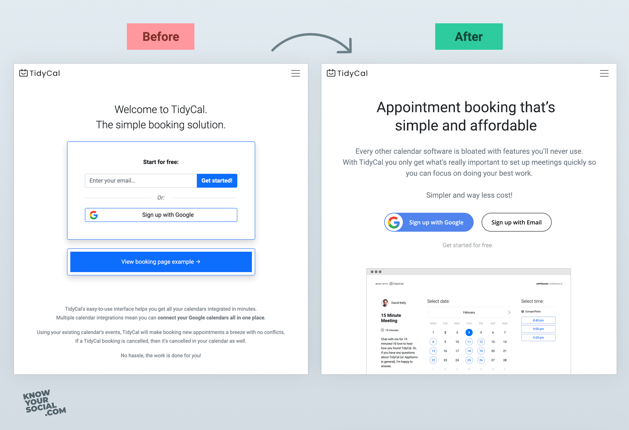
TidyCal is a great alternative to Calendly but their landing page could be a bit better!
So here’s a different take on the homepage.
My formula for above the fold:
1. Headline: What’s unique
2. SubText: How you achieve that
3. Visual: Show the product
4. Next: Give a simple call to action.
My assumption is that most people looking for a scheduling app already know the category and I would explain the benefits later on in the page not here.
TidyCal is “The Better Alternative”… without specifically mentioning Calendly. The focus here is on being Simple + Affordable.
Another headline I tried was “Appointment booking software shouldn’t be so confusing!”. Might need some A/B testing to see which works best.
👉 About TidyCal
Most people use Calendly as the default choice for appointment bookings.
The problem with Calendly is that it is full of useless features and the paid plans are quite expensive.
TidyCal was built to:
1. be simple by only giving the features which you actually use;
2. offer a paid upgrade at a more affordable $19 lifetime plan (vs. Calendly’s $8-$12/month);
Go try TidyCal out, it’s pretty cool.

